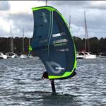
Why are companies making wings black? Seems to just be worse for everything; visibility on the water, longevity, cost (dyes?)
Longevity could be better as it stops UV attacking deeper into the material
but yeah agree on the rest ...
bloody trends and graphic designer / marketing dept has more pull than the actual user and team ![]()
true, i saw that they are removing the neon stripes on the m1, and also making the LE and strut darker black![]()
I had the North Nova V1 which were black. It was like foiling under a dark cloud all day! Glad they got rid of that by V2.
I'm Batman!
I think that's the reason, common! You want to be Batman, I want to be Batman, we all want the Bat Wing!!!
DC
Select to expand quoteDcharlton said..
I'm Batman!
I think that's the reason, common! You want to be Batman, I want to be Batman, we all want the Bat Wing!!!
DC
lol i think bright colours look better e.g Armie XPS
Select to expand quoteDcharlton said..
I'm Batman!
I think that's the reason, common! You want to be Batman, I want to be Batman, we all want the Bat Wing!!!
DC
Always be yourself
Unless you can be Batman
Then always be Batman
Select to expand quoteMicrosurfer said..Dcharlton said..
I'm Batman!
I think that's the reason, common! You want to be Batman, I want to be Batman, we all want the Bat Wing!!!
DC
Always be yourself
Unless you can be Batman
Then always be Batman
Unless ofcourse you need to be Bruce Wayne like for a fund raiser black tie event.
This might be a controversial take, but I think we need to get back to the graphic design trends of kites in the early 2010s. The completely whacky and unhinged graphics on the 2013 North Vegas were the pinnacle in my opinion (I still have this kite in my garage):
i like the pop culture references haha ![]() jokes aside, i agree, having some humorous artwork would be far more interesting than just brand logos on the wings, you'd just have to find the right space on the wing i think. might be able to tell a bit about the rider depending on what they have on there
jokes aside, i agree, having some humorous artwork would be far more interesting than just brand logos on the wings, you'd just have to find the right space on the wing i think. might be able to tell a bit about the rider depending on what they have on there ![]()