I stumbled upon this, doppler radar for Sydney ..http://mirror.bom.gov.au/products/IDR71I.loop.shtml
I had heard about this last week on the ABC... apparently part of a multi million dollar upgrade or something.
Now I just need to figure out who to read it...
Not sure how to read it.
the different colours, blues and yellows show both the wind strenght and direction in relation to the radar station at Terry Hills?
So at the moment its like a NW wind as its blue from the north west and yellow to the SE?
Plus the wind is strong in the NW over Colo Heights and Appin as the blue is a darker shade there. The wind is stronger close to Mosman and heading out to sea as its a daker shade of yellow, going into orange there too?
I'm not sure so any advice on reading the graphics would be appreciated.
It says it's coloured according to the component of wind towards or away from the radar. So if the wind was uniform NW the strongest colours would be directly up wind or down wind. The colours to the SW and NE of the station location will be soft even though the wind is of the same strength. But wind is never uniform, though it looks definitely from the NW given the direction of the divide between blue and orange. What's lake Illawarra like in a NW ? Might take a look.
Does anyone know at what altitude these radars usually work. eg. ground, 50 meters, 500 meters?
If it's the surface wind it will be very interesting to see how the reading during a summer NEer... Might actually be abel to spot with more accuracy why the wind is stronger south of the CBD vs the North Shore.
Anyone know if you they are planning to expand this beyond the current 128 km radius? Could be a great tool to find new sailing spots...
Someone please do a mash up with Google maps. Plus it would be great to click anywhere on the radar map and get a wind reading.
www.bom.gov.au/australia/radar/
The second page says it doesn't indicate ground level winds.
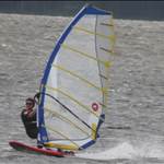
Cool - at least until we learn to read it we will at least have pretty pictures to look at... ![]()