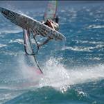
quit being so boring, when windsurfing was in its prime it was all about bright colours, and windsurfing stood out.. 5 years ago some sails were as invisible on the water as a kitsurfer without a kite.. colour defines windsurfing.
I fully agree, a few bright colors look great when the sun pops it's head out and lifts my mood![]() . When I was making boards for a job the rule of thumb was use no more than three colors plus white and black or it looks to messy .
. When I was making boards for a job the rule of thumb was use no more than three colors plus white and black or it looks to messy .
hey i respray my own boards once they start to get a few chips in them, love custom painted boards, who really wants to look like everyone else.. the custom Quatro's seem to be the only one doing them these days, miss the old glass board days of multi coloured boards... well for the graphics..
I know I'm nostalgic but there is nothing like a custom spray job on the old hand shaped boards![]() . Tabou rockects and starboard futuras are my favourites now.
. Tabou rockects and starboard futuras are my favourites now.![]()
The prettiest boards were the Mark Paul Bomboras like the South Pacific and the Bigtoy.
Those kangaroos made a good contrast with the bright orange plastic fantastic. Combined with the roo sails and how more Aussie could you get? And isn't that its all about, showing what that Australia is a great place to live and play?
Anyway this is an argument which is impossible to win.
bvllsh!farkin
whit with a bit of a design on top center. Nothing on the bottom or anywhere near the rails, makes them too hard to repair.
A smashed waveboard does prove your 'core' rating though.
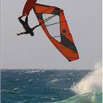
I think the 08 Tabou graphics are mean. They are bright and look really good on the water and off.
But you are right. If you buy a board for looks or even popularity over funktion then what the hell are you doing in the sport...