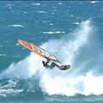
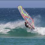
that fanatic thruster looks incredible, wish i had the money to spend on something like that
Interesting coincidence that both fanatic and JP quads are green, and thrusters are red ?
The NP "The Fly" looks more like "the Moth"
I reckon if you put 2 together, they would look pretty much like a huge moth!
(PS can someone do that and take a pic....)
(PPS, can I borrow your crystl ball for the weekend?)
I bet the development team at fanatic and JP had this sort of conversation:
Fanatic: right, lets run 2 colour trials for the thruster: Red and Green
JP Dev to Spy: Go find out what colour Fanatics thruster is...
JP: Right. Red? then lets go green... that will show them.
Fanatic: We Like the Green, lets go green!
Fanatic: what? JP have gone green? Lets go Red!
JP: What theyve gone green? Bugger, lets go Red.
Fanatic: Cheeky buggers have copied us. back to green.
JP: well if they want red, go to green.
Fanatic: DAMMIT! Back to Red.
JP: DAMMIT!!! Back to Red.
Fanatic: well, lets put the Quads green then to be different.....
etc.
Pretty colours
Bet the epoxy repair crew cant wait to colour match the smashed noses and rails on them.![]()
the underside of the fanatic quad and a 2013 north sail:

BTW, I don't like the look of the new JP logo.
Not a big fan of the JP Grafitti!
Looks like some kid took insipration from the 80's and wrecked a perfectly good looking board.
I prefer the clean lines on the fanatic... but even then, the styling doesnt appeal to me much.
I hope they surf better than they look.... (IMO)
Hey fingered when are you going to get your new JP then ?